


CASE STUDY, 2024
Developed throughout the Google UX Design Certificate.
OVERVIEW
Nabu is a mobile app designed to help people struggling with daily tech issues, specially in mobile devices.
ROLE
Product Designer
Product strategy, user research, UX/UI design, prototyping & testing.
Executive summary
PROBLEM
In a world where technology evolves at a very fast pace, a lot of people struggle to keep up with it and encounter daily issues while interacting with devices.
This issues are more common in the elderly community, since younger people are more used to deal with technology, but there are also people with disabilities or just not so tech savy people that struggles with similar problems.
SOLUTION
Built a mobile app that creates a support network between people struggling with daily technology issues, and volunteers that can help them resolve them for free.
Background
Currently there are no websites or apps with the exact same focus that Nabu.
The most similar one is Candoo Tech, a company that provides tech support and training to help older adults feel more comfortable with phones, computers, tablets, etc. They have a specialist team that communicate with users in a remote way to help them solve their tech issues. Candoo functions through a membership with different plans and prices.
There are some other companies such as Papa, that helps elderly people connect with people for companionship, everyday tasks, transportation, and more. They have a special program to teach their members about technology.
This gave me a challenging but exciting panorama since there are no real competitors to Nabu.
Research
I sorted 3 different types of potential users:
-Seniors
-Disabled people
-General users
Then, I conducted 8 interviews with 5 seniors, 1 person with specific learning disability, 1 person with low vision and 1 middle aged person.
The interview process was a very enlightening process since I gained a deep understanding on what are the most common issues people encounter, how are this people currently dealing with them and the most attractive potential features Nabu should have.
Here are some examples of the empathy maps created after the intervews:


Pain Points
I identified the pain points and grouped them into 4 categories:
Problems login in / remembering passwords
Difficulty finding what is being looking for in a webpage or app
Problems regarding non veridic information / fake news / spam
Updates, backups and storage issues
This pain points helped me confirm that there’s an actual area of opportunity for Nabu. Also, all of the 8 interviewed said they would be open to try a platform that connect them with people willing to help them solve technological issues, and would benefit from their use.
A big difference from platforms such as Candoo where there are IT specialists that can help the elderly by charging a membership, Nabu is looking to make the service free to users. To do so, we needed also to reflect on how the volunteers would be engaged and interested in helping others.
So I then conducted a more casual survey to 25 people between 21 and 35 years old, with different backgrounds and locations.
One of the most interesting findings was that all of the surveyed said that they are used to help senior friends and relatives with daily tech issues and they would definitely benefit from the use of a platform that makes more easy to do so. In the same path, 80% said that they would also benefit from the options to help not just known people but unknown people as well.
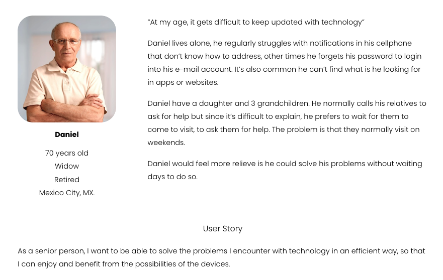
Personas
For the Personas creation, I decided to make 2 profiles for users and 1 profile for volunteers.


USER JOURNEY MAP
I build Daniel’s Journey Map, Problem Statement and Hypothesis Statement followed by a Goal Statement for the project.

PROBLEM STATEMENT
Daniel is an elder user who needs to efficiently solve problems he encounters when using mobile devices and computers, because he’s not technologically savvy.
HYPOTHESIS STATEMENT
If Daniel finds a way to get help with tech problems in real time, then he’ll have a better experience using devices, which will improve his life quality.
GOAL STATEMENT
Our platform will let users to connect with random or specific volunteers to solve tech issues, which will improve their lives by making the experience of using electronic devices more pleasant.
We will measure effectiveness by allowing the users to rate the support given by volunteers.
Competitive Analysis
Since there are no direct competitors to Nabu, I selected 3 platforms that provide a support network for the elderly.

How Might We…
Here are some How Might We questions that helped me translate problems into opportunities for design.
How might we provide an easy to use platform?
A: Users need to be able to go straight and seamlessly to the post an issue and receive help.
How might we connect users with volunteers?
A: By video call and by sharing in realtime their screen, by messages and sharing photographs.
How might we ensure users find the right volunteer?
A: By letting contact specific people or segmenting the issues so it's easier for volunteers find a segment where they are good at.
How might we protect users and volunteers privacy?
A: By recording all the messages, phone-calls and video-calls and blocking the use of delicate data apps such as banking apps.
How might we avoid turning Nabu in another tech problem for users?
A: By keeping things as simple and straightforward as possible
How might we attract volunteers?
A: By making alliances with companies and get some discounts with a points system, where you receive points for solved issues that you can later trade
Storyboard
USER
Daniel opens his smartphone and sees a notification regarding the storage, he doesn't know how to address it.
He then opens Nabu and post an Issue.
He can choose from 4 different options of common problems, write a bit about the issue if the want, and post it.
A message let Daniel know that he will receive a call when a volunteer has accepted his request to contact.
A few minutes later, Daniel receives a message through Nabu. It’s Laura, a volunteer that offers him to do a video call in which she will see through his screen to guide him to the solution.
Laura calls him together they solve the problem. Then Laura ask Daniel if she can help him with anything else.
Daniel thanks Laura's help and end the calling.
A message pops up to let Daniel rate the help provided by Laura.
VOLUNTEER
Laura receive a notification in her phone that a random Nabu's User is requesting for help.
She can't answer right away but a few minutes later, she opens Nabu and contact Daniel through a message.
She let Daniel know that she can help him by calling him and he accepts it.
Laura call’s Daniel and once he answer, she ask him to guide her through the problem.
Once she has helped him and they end the call, she receive a message letting her know she has earned points.
With this earned points, she has gather the necessary points to use them to get a gift card from Amazon.
Wireframes

First ideas

Selected design
Digital Wireframe


Usability Study
I build this Lo-Fi sequence following Daniel’s storyboard. This was extremely helpful because I was able to use the prototype to conducted a small Usability Study with 2 potential users.
This are the more relevant findings from the study:
The users felt overwhelmed with all the information in the main screen.
The top navigation bar felt confusing.
The general design felt “standard”.
The blog section was distracting the users from the “Post your issue” area.
The “Contact a specific user” next to “Post your issue” was also confusing.
Redesign


Using the feedback from the Usability Study, I redesigned taking into account that “Posting an issue” must be the central action in the main screen, taking all the noise and information non relevant away.
Also, I decided to completely take out the top navigation bar and to redesign the bottom navigation bar so that in the main screen, the icons would appear bigger and with text and then transition into the bottom into smaller icons for users to identify better.
Hi-Fi Prototype

User scenario
The user opens the app and taps to get help
Selects a category and describe their issue
Gets a confirmation that their request has been sent

The user receives a message from a volunteer, explaining that they’ll call them to to address de issue
The user receives a call from volunteer and work together to solve the problem
At the end of the call, the user rates the aid provided

Volunteer scenario
The volunteer receives a notification about users seeking for help
They select a user case and write to let the user know that they can help them
The volunteer call the user and help them solve their problem
The volunteer earns points that can trade for goods later
Learnings & Takeaways
This case study undoubtedly left me with many valuable lessons. The focus on a non-profit platform like the one proposed allowed me to concentrate fully on solving problems in the simplest way possible, without adding any issues for the user, particularly in how to provide help to someone who is frustrated by not being able to solve a situation with their mobile devices on their own.
It was very interesting to conduct the usability study and realize that there were subtle but significant changes that greatly improved the user experience, and others that required a deep redesign.
I believe that the proposed concept would be very helpful for many people struggling with daily technology issues. It would definitely be an application I would use as a volunteer to help my parents and strangers resolve the technological problems they face