CASE STUDY, 2024
Developed throughout the Google UX Design Certificate.
OVERVIEW
Med Report is an app that helps you keep your medical information organized and up-to-date, so that your doctor visits are more efficient and shorter.
ROLE
Product Designer
Product strategy, user research, UX/UI design, prototyping & testing.
Executive summary
PROBLEM
Going to a new doctor is a bit of a challenge for some people, specially the ones with a long clinical history. Sometimes it can be hard to remember all the relevant information the physician need to know in order to make the best diagnosis and treatment.
SOLUTION
Build a dedicated app that allows users to build in an easy and quick way, a complete clinical history to share with your healthcare provider.
Background & Research
In today's healthcare environment, managing personal medical information can be a complex and time-consuming task. Patients often struggle to keep track of their medical records, medications, lab results, and doctors' visits. This disorganization leads to inefficient consultations, missed or incomplete information, and longer appointment times.
From a patient perspective, managing medical records is burdensome. A survey conducted by the Pew Research Center in 2021 revealed that 35% of respondents found it difficult to access their medical information across different providers. Even when records are available, they are often fragmented across various systems, and patients must compile them manually. As a result, many patients enter medical consultations ill-prepared, causing delays and inefficiencies in care delivery.
EXISTING SOLUTIONS
Several mobile apps already address aspects of medical record management, such as MyChart, Apple Health, and Google Fit. However, many of these focus on general wellness or are tied to specific healthcare systems, which limits their versatility. Moreover, these apps are not available in Mexico.
PROCESS
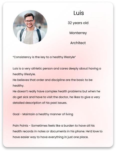
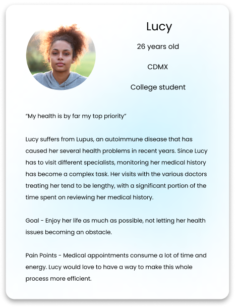
After doing secondary research, I conducted 4 interviews from which I build personas. Also, the interviews helped me to restraint the scope of the project and set a very clear value proposition for it.
Personas
Wireframes Storyboard
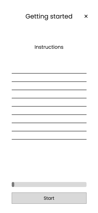
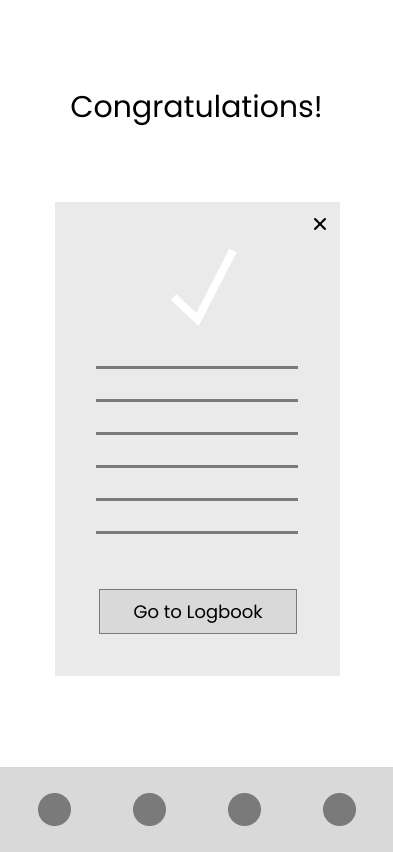
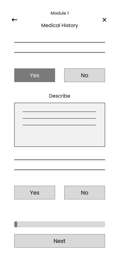
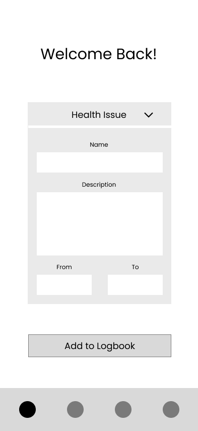
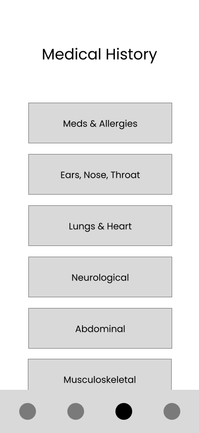
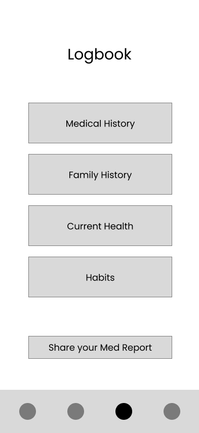
Key Digital Wireframes
Brand Identity and UI Components
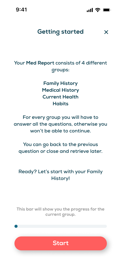
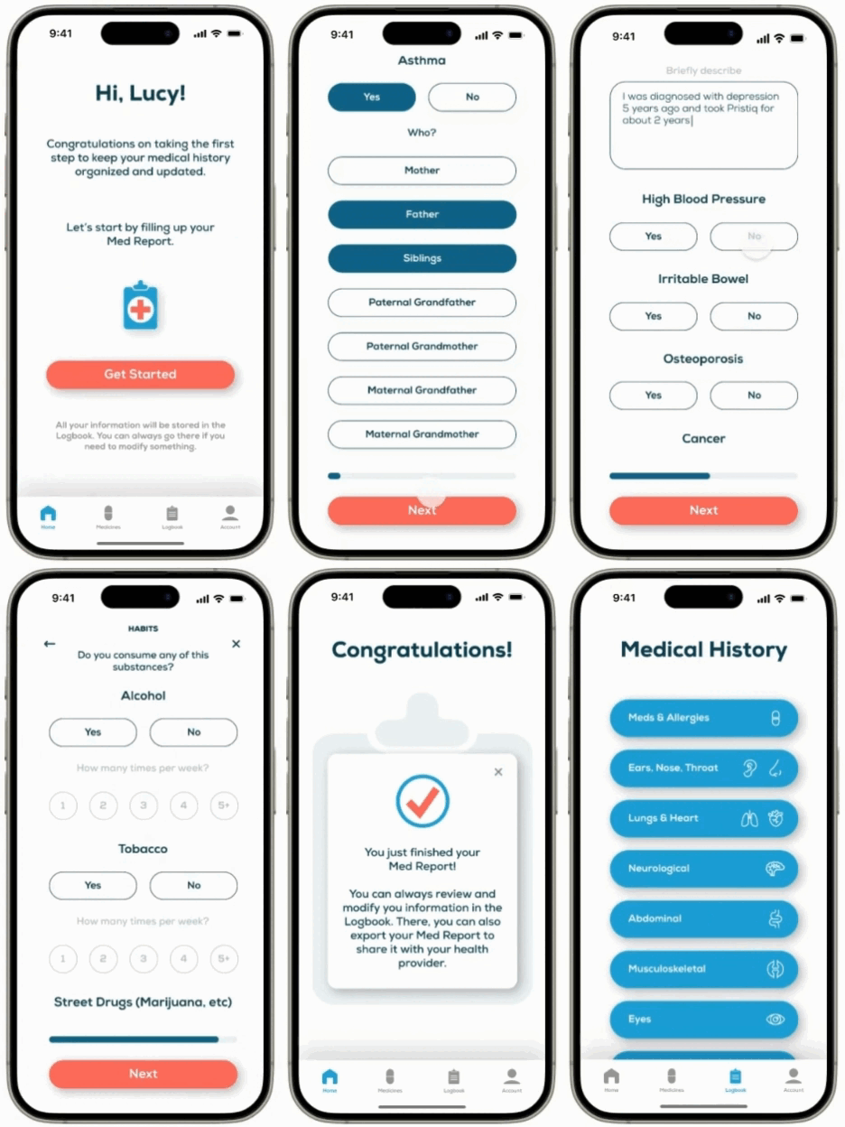
Key Hi-Fi Screens
Hi-Fi Prototype
Learnings & Takeaways
The most intriguing challenge in this case study was figuring out how to keep users engaged while asking them to provide a large amount of information, without making the process feel overwhelming or tedious. The solution? A combination of strategies: simplifying the questions, grouping similar ones, and most importantly, minimizing the amount of typing required to make the process more efficient and user-friendly.
A key takeaway from the usability study was identifying which questions were easiest or hardest for users to answer, and discovering the most effective ways to group and present the information.
This case study has given me invaluable lessons for my professional growth. If this were a real project with more time and resources, the next logical step would be to redesign the format in which doctors receive the information, followed by an in-depth usability study of the prototype to refine and perfect the process.


